
So June is the first month of summer and I wanted to create a summery theme, hence I went with ice cream! Rhyme not intended… or was it?
I really liked how this turned out, namely the font for it as well, as it was quirky and simple. I went with ice lollies as well as ice cream in a wafer cone, even though I know I sadly can’t eat them 😦 Being gluten and dairy free can be tough sometimes, but actually there’s a lot of ice creams out there that you can eat. I absolutely love the vegan magnums, and they sell them individually in our local Co-op. Also, we have some ice cream places in town that sell vegan ice cream! They’re a bit expensive, but in the summer by the beach it’s nice to know there are options.
I chose a mix of bright colours for June, because it’s summer and all, and I think they work well with the more brown and tan colours of the cornets – and chocolate ice cream of course.
The ice lollies were pretty easy to doodle. There’s sort of long rounded ones, rounded short ones, and sort of triangular lollies, and I tried to make them as striped as possible because the cornet ice creams are entirely tan with the ice cream showing off the summery colours. Perhaps you can determine the flavours? I think there’s definitely chocolate in there…
So, here’s the colourful spreads for the beginning of this month.
Monthly Theme Spread

“Never settle for just one scoop.”
Amen to that quote. Sometimes there’s just so many ice creams out there we can’t choose! So definitely get an extra scoop of something tasty. It is summer after all.
The front page is quite simple and straightforward, and I sort of wish I could have done more, but I quite like the quote page with its mix of fonts – the striped font and the cursive font. Maybe at a future date I’ll add more to it besides the colourful ice creams, but in the meantime it’s clearly what it says on the tin – ice lollies and cornets.
Monthly Spread Page
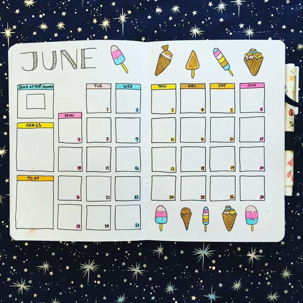
Keeping with the colourful theme, I have the colours all shown in columns throughout the monthly boxes, with the ice creams along the top and bottom of the page. The boxes for each day I decided to have floating across the page, which I think looks simple and elegant.
There’s also a box for the song of the month, monthly goals, and a box for monthly to do’s, with the headers in the colourful colours of this month’s theme.
First Weekly Spread
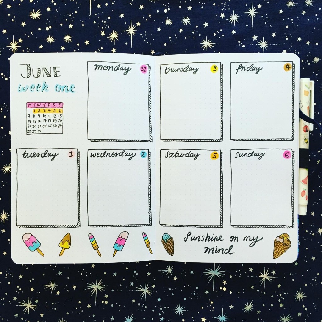
Onto the first weekly spread! This is pretty straightforward spread with 12 by 15 square boxes for each of the days spread across the double-page. I added a sort of striped drop shadow on each of the boxes to fit in with the main font I used, and there’s a bunch of ice lollies and ice creams along the bottom of the page, with a little quote.
“Sunshine on my mind.”
Overall I really liked how this month’s theme took shape. I might not be able to eat many of the ice creams and lollies, but it’s pure summer, isn’t it? The moment the sun comes out we reach for a cone and our favourite flavours…
My favourite ice cream now might be the almond vegan magnum, or the salted caramel one… I can’t choose.
What’s your favourite ice cream?
Kate @ Kandid Chronicles x
